Wednesday, June 30, 2010
2 Page Sketch #7
I have to admit that I totally forgot about this sketch! Luckily I had given it to Tami and she created a fantastic Toy Story Mania layout. For close ups and details Visit Tami's Blog HERE. Thanks Tami!!!
Merrick isn't a fan of the banners so she skipped them on her layout, but its still really cute. I think its really nice to be able to start with a sketch and take it in a direction that works for your pages. Check it out HERE.
Angela sent me this beautiful layout for this sketch.Visit Angela's blog HERE
Sunday, June 27, 2010
Sketch #32 12x12
Here is my example using some Basic Grey papers and a bit of masking at the top for the lacey bit up there. For details and close ups visit my Blog HERE.
Tuesday, June 22, 2010
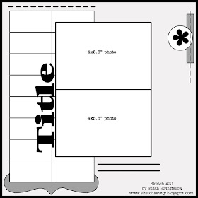
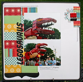
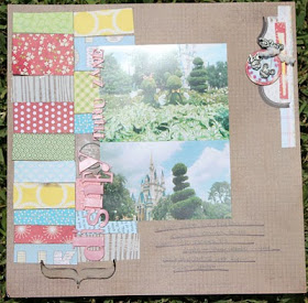
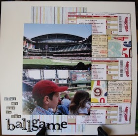
Sketch #31 12x12
For my example I used Cosmo Cricket Cogsmo and Garden Variety collections.
Kristin did a very cute Disney layout with the same sketch and photos from her son's disposeable camera! Check it out HERE
Ok this is just too creative! Look at the tickets that Joni used for the rectangle shapes in this sketch. Great job, Joni! Visit Joni's blog HERE
Sketch #30 12x12
For my example I used The New Boardwalk Collection by Little Yellow Bicycle with it's whitewashed tropical colors and swirly water paper is just the right feeling for these silly photos. I made a flip sleeve, so I could put 2 more photos under the right photo. For Close ups and details Visit My Blog HERE.
Here's an example by Merrick. I just love that her title and journaling too. :)
Thanks Merrick!
Joni Parker did the cutest page using this sketch. I love the way she used the clock for the circle with the title. Check out Joni's blog HERE
Tami turned this sketch into a 2 pager and created this layout about the amazing Dave Smith. I cant tell you how jealous I am that she got to meet him and go to the Disney Archives. Visit her blog HERE for the details and close ups.
Look at this totally sweet page by Rachel. If you visit Rachel's blog HERE, you can see close ups of her hand drawn stitching. For those of you who love the look but hate the machine, it's a great alternative!
Monday, June 7, 2010
Sketch #29 12x12
For my example I used DCWV Safari Stack and the background is Cosmo Cricket Coredinations cardstock.
Hop over to Disney Scrappers to see Zoe's great Pirate Layout using this sketch. I just love the way she added the EK 3D stickers and her Pirate Trading Pin.
Laurie was very clever and modified this sketch into a great 2 page layout. See Laurie's layout and close ups HERE.
Look at this beautiful fall layout from Nancy. Its a totally different look and it makes me want to do the page again. :) Visit Nancy's Blog Here
Tuesday, June 1, 2010
Sketch #28 12x12
Tami helped me with this sketch and she also made a page as an example. I think its fun to use the little wallet sized photos sometimes and this is a perfect example. She used all Graphic 45 papers. For close ups visit Tami's Blog HERE.