Friday, July 30, 2010
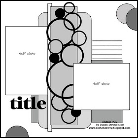
Sketch #37 12x12 with Circle border
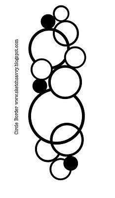
***Be sure to mention SketchSavvy with a link when you use this file. As always, leave a comment and let me know what you think of the sketch and cut file. Have Fun!
CLICK HERE for the Circle Border SCAL2 File
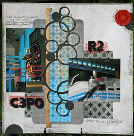
Here is my example. For close ups visit my Blog HERE.
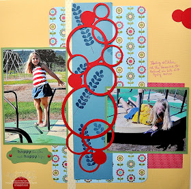
Look at this cute page by Pat - she used the cut file and the sketch. Thanks for sharing Pat!
Monica sent me a link to her cute summery page using this sketch and her own circle cut papers. I love these circles for summer pages. **CLICK HERE to see Monica's Layout**
Joni had a fantastic twist on the sketch and circles, she took away one photo and added her title in that space and then she stamped the circles with acrylic paint! I just love stamping with paint so I think its pretty cool and her title is perfect. Check out Joni's layout HERE.
Saturday, July 17, 2010
Sketch #36 12x12 with Scalloped Square Frame
I love the sketch and cut file for today. It's easy and lets you used lots of different pieces of papers that you like. You can even use up some little scraps.
***Remember the cut file link is just under the .jpg image of the frame. Be sure to mention SketchSavvy with a link when you use this file. As always, leave a comment and let me know what you think of the sketch and cut file. Have Fun!
CLICK HERE for the Scalloped Square Frame 1 Cut file
Here is my example using Basic Grey Oliver Collection. For details and close ups CLICK HERE
Just look how beautiful this sketch can be with a softer palette of colors! Thank you Nancy for sharing this page. Visit Nancy Burke's Blog HERE for close ups and details.
Friday, July 9, 2010
Sketch #35 12x12 with Pompom border
Today's cut file is a what I call a pompom border. I love this one, but I will tell you that cutting it from glittered paper requires a new blade and mat or the deep cut blade. Do you like this border? Leave me a quick note and of course if you use this file be sure to mention SketchSavvy and include a link. Thanks!
CLICK HERE FOR THE POMPOM BORDER SCAL2 file
Here is my layout. I deviated a bit from the sketch because I really wanted to try the white washed masked thing. For close ups and info visit My Blog HERE.
Jeanne used the sketch to do this beautiful page and I just love her anchors! Very cool She used a mist across her papers rather than the whitewash which is cool, and she used a scallop at the bottom.
Pam used this sketch with a really cute twist - she used real pom pom trim for the border where my die cut is. Check it out HERE
Saturday, July 3, 2010
Sketch #34 Stars & Stripes
Happy 4th of July! I have a very simple but fun layout and file for you today. It's simple stars and stripes but you can use up some scraps and get parade photos done so fast. Remember the cut file link is just under the .jpg image of the little stars. Be sure to mention SketchSavvy with a link when you use this file. As always, leave a comment and let me know what you think of the sketch and Have a Safe and Happy 4th!
CLICK HERE FOR THE 4STARS SCAL2 FILE
Here is my example. I used Basic Grey and October Afternoon papers.
Jackie was sweet enought to send me the link to her adorable layout using this sketch and the stars. See Jackie's Layout HERE
A very nice page from Rachel. I really like her paper choices. Visit Rachel's Blog HERE for close ups.
Friday, July 2, 2010
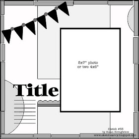
Sketch #33 12x12 with SCAL2 file!
I am excited to announce a NEW feature here at Sketch Savvy! I am going to be sharing my SCAL2 designs with you so that you will be able to cut them with your Sure Cuts Alot software and http://www.cricut.com/. I will also include a .jpg image. I have to thank my good friend Heidi Smith with the concept! THANKS HEIDI!!!
I will include designs that will coordinate with the sketches and just below the image you will see a link to download the SCAL2 file. I just ask that you list Sketch Savvy (*Including a link) when you use them on your layouts. Of course I would also love to see your projects so be sure to leave a comment here with a link.
Here is my first Sketch with a coordinating file for the little scalloped banners. **Note: these banner files are not the exact size that I used for this layout. You can resize them however you like to fit your page.
DOWNLOAD "BANNER1" SCAL2 FILE
And here is my example layout using the beautiful New Basic Grey Oliver Collection. For close ups and details visit My Blog HERE.
This is another version by Kathy Lewis. I just love the bigger banners and her choice of papers. Thanks Kathy!
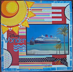
I just have to share Laurie's layout because she turned the banner into the most adorable sun! Her page just makes me want to go on vacation.
Nancy stepped outside the box a bit with this sketch, so I just have to share her beautiful page! Visit Nancy's blog HERE.
Joni did the sketch without the banners, and she staggered her side strips which looks really cool. Also check out her awesome title! ***SEE JONI'S LAYOUT HERE***
And it looks like this sketch is perfect for baseball photos with these pennants! Pam did the cutest red, white, and blue page with a baseball theme. CLICK HERE TO SEE PAM's LAYOUT AT DISNEY SCRAPPERS
Now they are Flags! I never would have thought of it but Nylene made the cutest little flags using this banner cut file. CLICK HERE to see Nylene's Layout.
Now Jackie did the sketch without the banners for her cute Little Monkey layout. Click HERE to see Jackie's Layout
The next layout using this Sketch is from Laura and its just too cute. See Laura's Layout HERE at Creative Charms
I will include designs that will coordinate with the sketches and just below the image you will see a link to download the SCAL2 file. I just ask that you list Sketch Savvy (*Including a link) when you use them on your layouts. Of course I would also love to see your projects so be sure to leave a comment here with a link.
Here is my first Sketch with a coordinating file for the little scalloped banners. **Note: these banner files are not the exact size that I used for this layout. You can resize them however you like to fit your page.
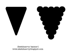
DOWNLOAD "BANNER1" SCAL2 FILE
And here is my example layout using the beautiful New Basic Grey Oliver Collection. For close ups and details visit My Blog HERE.
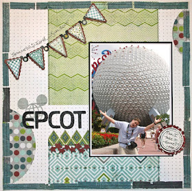
This is another version by Kathy Lewis. I just love the bigger banners and her choice of papers. Thanks Kathy!
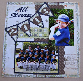
I just have to share Laurie's layout because she turned the banner into the most adorable sun! Her page just makes me want to go on vacation.
Nancy stepped outside the box a bit with this sketch, so I just have to share her beautiful page! Visit Nancy's blog HERE.
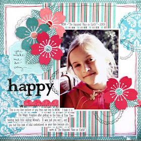
Joni did the sketch without the banners, and she staggered her side strips which looks really cool. Also check out her awesome title! ***SEE JONI'S LAYOUT HERE***
And it looks like this sketch is perfect for baseball photos with these pennants! Pam did the cutest red, white, and blue page with a baseball theme. CLICK HERE TO SEE PAM's LAYOUT AT DISNEY SCRAPPERS
Now they are Flags! I never would have thought of it but Nylene made the cutest little flags using this banner cut file. CLICK HERE to see Nylene's Layout.
Now Jackie did the sketch without the banners for her cute Little Monkey layout. Click HERE to see Jackie's Layout
The next layout using this Sketch is from Laura and its just too cute. See Laura's Layout HERE at Creative Charms