Thursday, August 26, 2010
Sketch #41 and Bracket Square #1
The cut file for today is a very basic shape that is very useful. If you don't have a die cutting machine that will work, just print the shape on the back of your paper and cut by hand. As always, these are in no particular size so I thought I would show you several uses over the next week. My first sketch uses the square around 6" and the frame around 3".
***Be sure to mention SketchSavvy with a link when you use this file. As always, please leave a comment and let me know what you think of the sketch and cut file. Have Fun!
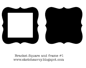
***CLICK HERE for the Bracket Square #1 and frame.***
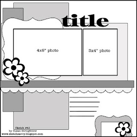
Here is my example layout. For close ups and info VISIT My Blog HERE
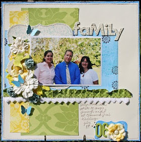
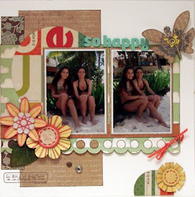
Another beautiful layout from Luz Maria. I just love her paper choice and that paper she used for the circle makes the whole page feel tropical. Visit Luzma's Blog HERE
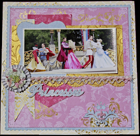
Orlanda shared this truely fantastic layout using this sketch and one of the other cut files too. I just love the papers she used to go with this perfect photo. See Orlanda's disney layouts here
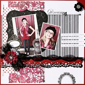
Now just look at this very sweet layout by Karin! Click HERE to visit her blog for close ups
This page by Nancy Burke was just so stunning that I didn't even know it was my sketch and I guess turning it on its side was just a nice surprise to me because I totally want to copy it now. LOL Thanks Nancy! Visit Nancy's Blog HERE
Wednesday, August 25, 2010
2 page Sketch #8
You asked for more landscape photos on 2 pagers so here is the first one. I will try to come up with some more soon. I didn't add alot of embellishment to the sketch since space is limited and I thought you could add whatever you like. I added banners to my example because there were banners in my photos.
For my example I use all Basic Grey Marrakech collection. For close ups and details CLICK HERE to visit my blog.
My friend, Lisa, from DisneyScrappers was sweet enough to send me her example of this sketch. I love the way she cut the patterned papers for the corners. Visit Lisa's awesome Disney gallery HERE
Look at this fantastic layout by Angela. I just love her photos and her title is perfect. Visit Angela's blog HERE
here is a totally beautiful Tangled layout from Tamera. I just love the whole thing. For close ups and details, visit Tami's blog HERE
Wednesday, August 18, 2010
Sketch #40 and label cut file
Another page that is fun and quick. The squares I used are 2.5". And today's cut file is this cute little label that would be fun in any size.
***Be sure to mention SketchSavvy with a link when you use this file. As always, please leave a comment and let me know what you think of the sketch and cut file. Have Fun!
***CLICK HERE to download the Label #2 and shadow SCAL2 file***
My example uses DCWV papers. Click HERE for close ups and details.
Luz Maria Bruna combined this sketch with the Color Combos Galore challenge and created this Amazing layout! Isn't it wonderful. Visit Luzma's BLOG HERE to see more of her beautiful work.
I just have to share this adorable Disney layout Orlanda using this sketch.Visit Orlanda's disney gallery HERE
And here is Tiffany's example using Crate Paper. I just love that collection.
I know I am adding alot of pages as examples here but they are just all so different and this is really a fast page if you have the perfect papers. Check out http://joniparkerstuff.blogspot.com/ page. She turned it on its side and added the great building border. I just love it. Visit Joni's Blog here.
Monday, August 9, 2010
Sketch #39
This sketch has a 4 piece motif that is really simple and fun to use anywhere on a layout. For this sketch, you need to cut your 4 piece design about 3" square to allow room for the 4x6" photos. ***Be sure to mention SketchSavvy with a link when you use this file. As always, please leave a comment and let me know what you think of the sketch and cut file. Have Fun!
***CLICK HERE for the 4 Piece Motif SCAL2 cut file***
For my example I used mostly DCWV Citrus Stack. For close ups and more info Visit My Blog HERE.
For my card I used the Citrus Stack by DCWV
Here is a fantastic example by Joni Parker! She actually created her own shapes by cutting squares and rounding the corners and I think it turned out just perfectly. Drop by Joni's Blog Here and see her other beautiful layouts.
Tami turned this sketch into the cutest two page layout EVER! I just have to find pluto photos so I can do this too. Visit Tami's Blog HERE for close ups
Wednesday, August 4, 2010
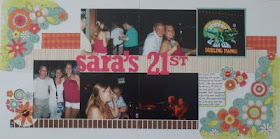
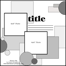
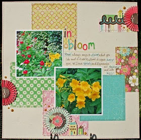
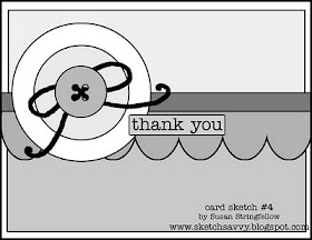
Sketch #38 12x12 and Card Sketch #4
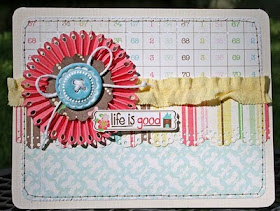
I used the same cut file for the layout and card so I am including both here. The cut file is a border strip that can be used as is, or accordion folded to create a circle embellishment. For close ups and details on how to create this embellishment, CLICK HERE to visit my blog.
***Be sure to mention SketchSavvy with a link when you use this file. As always, please leave a comment and let me know what you think of the sketch and cut file. Have Fun!
*All of the square pieces of paper in this sketch are 4" squares*
CLICK HERE for the Scalloped hole border
For my layout and card I used Echo Park's Life is Good Collection. To see close ups and details CLICK HERE