Sunday, August 28, 2011
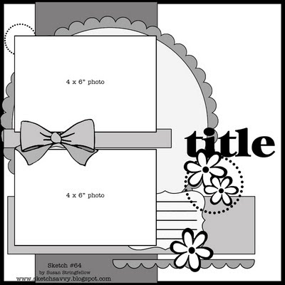
Sketch #64 12x12
I know you guys always ask for more layouts using landscape oriented photos, so here is another one. And for my friends who are asking for more layouts with one landscape and one portrait (you know who you are :), I am working on it. Those are tricky for me too. LOL! For my example I used the new Basic Grey Out of Print Collection. If you would like to see close ups and details, Visit my Blog HERE.
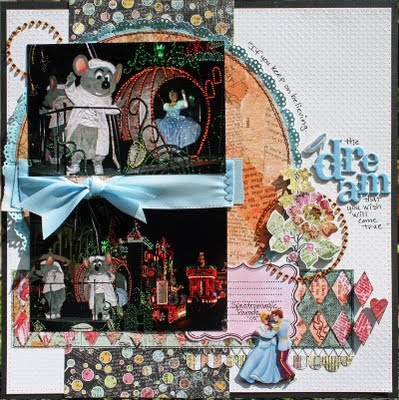
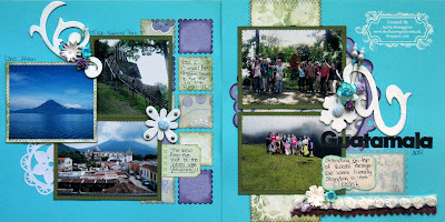
ok you guys are going to love this! Anita took this sketch and sketch #62 and combined them into one really beautiful 2 page layout! Isn't that a neat idea?! Thanks for sharing your pages, Anita Visit Anita's blog HERE
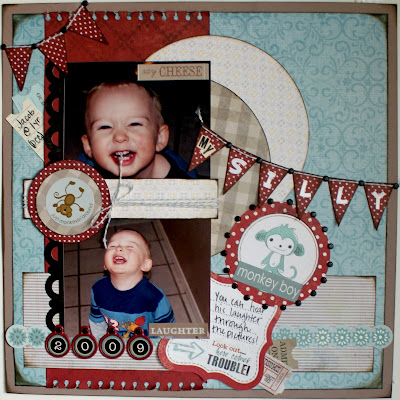
Jenny just sent me this precious page and I just had to share. I love her papers and use of the banners. Visit Jenny's blog here for more.
here is a page from Shaunery with some cool ribbon edging on the circle. Don't be afraid of texture going under photos, just cut it where it goes under the edge and you don't have to worry about the bump. :) Thanks Shaunery! Visit her blog here.
Joni sent me this totally fun version of the sketch. I think the buttons across the middle are perfect. Visit Joni's Blog HERE
Monday, August 22, 2011
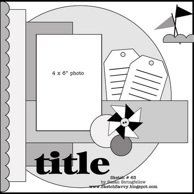
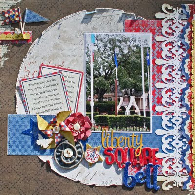
Sketch #63 12x12 and a Cut file!
I know some of you love cut files and probably thought I had given them up but I just haven't felt inspired lately. Well I needed a good border for this page so I made this fleur border. I am giving you a link to the SCUT2 file as well as a .jpg image so you can use it with some of your die cutting machines.
***Here is the link for the Fleur Border SCUT2 file***
***Be sure to mention SketchSavvy with a link when you use this file. As always, please leave a comment and let me know what you think of the sketch and cut file. Have Fun!
And here is the .jpg image - click the image to enlarge before saving.
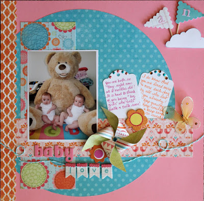
Oh my goodness, you have to see this adorable layout from Melissa D. She has the sweetest photo but the papers and embellishments are just great fun too. This is a great example of how the same sketch can look completely different. Have you guys ever used one sketch twice? Give it a try. Visit Melissa's blog here for more.
Tuesday, August 9, 2011
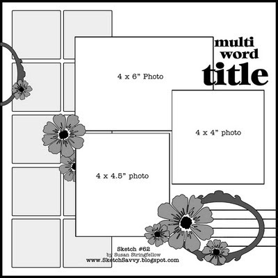
Sketch #62 12x12
Here is my example - I also created this page for Color Combos Galore challenge #204 HERE. For close ups and details visit my blog HERE
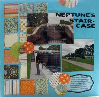
Colinda sent me a link to her wonderful travel page. I love that this sketch lets people use all their fun patterned papers. I just love the blue and orange combination. Check out Colinda's blog here
http://www.blogger.com/img/blank.gif
More awesome papers used here in Shaunery's layout. Just rich colors that are ideal for her photos. Visit Shaunery's blog HERE.
Joni sent me this super warm rich page using this sketch and I just love the way she stitched the blocks. Visit Joni's blog here to see more great pages
Subscribe to:
Posts (Atom)