Monday, May 15, 2017
Sketch #180
For my example I decided to stick pretty close to the sketch because I wanted to use a really big font so I could do a fun circus layered font.
Thursday, April 20, 2017
Sketch #179
I did this one specifically for my friends at www.DisneyScrappers.Ning.com and I haven't had time to do an example page but Janeen Beuchel was kind enough to share this example. Thanks Janeen!
Friday, March 3, 2017
Sketch #177
Another sketch created from an older multi photo layout. This one has 2 large 4x6 photos and still has room for embellishment and a 3rd smaller photo.
Sketch #176
Since I have not had too much time for scrapping lately I decided to turn a couple of my favorite multi photo layout designs into sketches.
This one has space to change the dimensions of your photos as well. What I like best about this page is that although there are 3 nice sized photos, you still have areas of background for your eyes to rest and it doesn't look too busy.
**** I have to point out that the photo on the left says 4x6 but it is actually a 4x5 photo shape, but with a bit of shifting, you can squeeze a 4x6 in there.
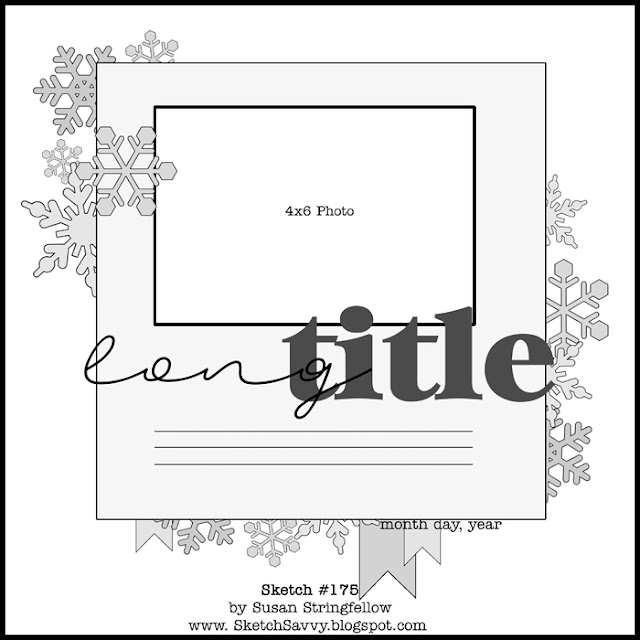
Sketch #175
I am looking forward to trying this sketch but wanted to share it with you guys first. I think it would be fun with lots of different shaped things in place of the snowflakes : stars, hearts, circles, Mickey :), flowers, doilies, or a combination of elements
I also left plenty of space to change photo size or you could include two rather than one.

I hope to have an example for you soon
Sketch #174
For my example I have used the Pink Paislee Fancy Free collection of papers . I turned one of the photos and moved the title
Subscribe to:
Posts (Atom)


