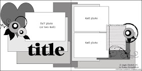
For my example I used Basic Grey "Archaic"

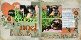
I just love this beautiful but funny page by Tami. Visit Tami's Blog for close ups and details.

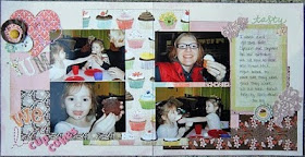
This page is by Tiffany - just look at all that yummy Basic Grey Nook and Pantry! What a cute layout- Visit Tiffany Here.


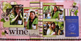
This one might be one of my favorites. So simple, but it has such great layering and composition. Really well balanced. Totally using this one soon!!
ReplyDeleteI used this sketch for this layout. http://2.bp.blogspot.com/_h7OS8p0Wvg4/S_L9uWrkJFI/AAAAAAAABdY/Lo8mjmgoRnY/s400/007.JPG
ReplyDelete