Sunday, December 4, 2011
2 page Sketch #13
Here is my example using My Minds Eye "12 Days of Christmas" collection. Visit my blog here for details and close ups.
Monday, November 14, 2011
Sketch #69 12x12
This is my attempt at a fall themed sketch and I totally didn't do a fall layout. LOL! But I did have alot of fun with the sketch. I used October Afternoon Sidewalks collection. See details and close up photos on my blog HERE
Fern was kind enough to share her beautiful layout with us. I just love all the border punching and layering. For more details, visit Fern's blog HERE.
Laurie shared her version of the sketch and you just have to love the little kitchen banner! How cute is that?! Visit Laurie's blog HERE for close ups.
Another wonderful interpretation using some beautiful DCWV papers. This page is from Scossie Jane, for close ups and details visit her blog here
Thursday, November 3, 2011
Follow by email?
hey guys, I just added a gadget on the side bar of this site------>
So if you guys want to get a little email when I post a new sketch, you can go add your email there and it will start sending them out to you. I like it when people have those because I rarely take the time to go thru my long lists of fave blogs, but having it come into my email keeps me from missing things. I just wanted to give you a heads up. I also added one to my regular blog CreativelySavvy.
So if you guys want to get a little email when I post a new sketch, you can go add your email there and it will start sending them out to you. I like it when people have those because I rarely take the time to go thru my long lists of fave blogs, but having it come into my email keeps me from missing things. I just wanted to give you a heads up. I also added one to my regular blog CreativelySavvy.
Sunday, October 30, 2011
Sketch #68 12x12
Here is a sketch that I did for my friends at Disney Scrappers. I just thought it would be fun to have a somewhat subtle mickey in the design.
And here is my example using new October Afternoon Sidewalk collection. For close ups and details visit my blog HERE.
here's a great take on this page from Dria at Disney Scrappers. I just love the banner over the yellow mickey. Visit Dria's gallery HERE
My talented friend, Luz Maria, sent me this beautiful layout using Basic Grey Picadilly. Isn't it just amazing! Visit Luz Maria's blog Here to see more
Thursday, October 13, 2011
Sketch #67 12x12" with frame cutfile
I have a very fun sketch for you today. It has some cute element ideas and even a couple of cut files for those of you who have Sure Cuts Alot2. If you don't have that program, you can use the .jpg file below as a paper template. I also use the new DCWV "French Country" stack and a bit of brown tweed paper from Michaels' Recollections "Regent Street" stack by DCWV.
Click Here for the Frame and Mat SCUT2 file
***Be sure to mention SketchSavvy with a link when you use this file. As always, please leave a comment and let me know what you think of the sketch and cut file. Have Fun!
Darlene was nice enough to share her fantastic layout with us, and don't you love that cute envelope with this sketch? I love the colors she chose and the photo is just so sweet. Visit Darlene's blog HERE for close ups and details. Here's a layout from Dria that is super fun. I love the sparkly title and beautiful photo. Thanks Dria!
Thursday, September 15, 2011
Sketch #66 12x12
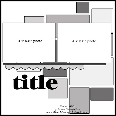
For my example, I have used Basic Grey's Oxford collection. I know you guys like sketches where we get to use alot of patterned papers and even better when you can use scraps! For close ups and details visit my blog HERE
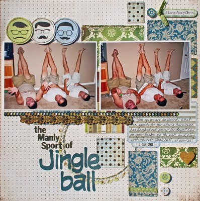 I knew I was going to love seeing pages with this sketch. Just check out this totally cool page from Shaunery! The photo cracks me up and the papers are fantastic. Visit Shaunery's Blog HERE for details and close ups.
Here is a great one from Joni Parker. I love the papers she used and since we have had our fair share of the wild fires here in Texas this year, I am thinking I might copy this idea. Visit Joni's Blog HERE to see more
Tuesday, September 6, 2011
Sketch #65 12x12
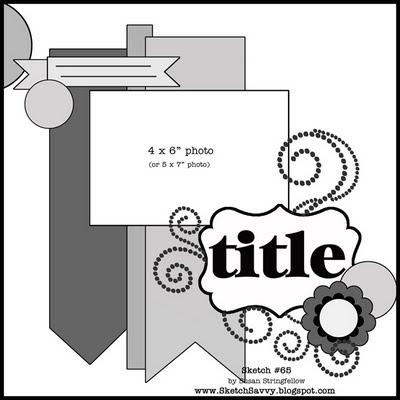
I actually created this layout and then made a sketch based on the page for you guys. I thought you might like to try the long banners. The papers are all from the gorgeous new Tradewinds Stack from DCWV (See it HERE) and I wish I could say that the lovely photo is mine, but it is a borrowed photo.
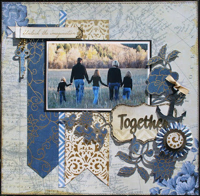
I just received this fantastic layout from Isay. I just love the papers and embellishments she chose. That checked background really makes it feel like fall. Visit her blog HERE
 Here is a gorgeous layout by Monique Fox. Visit Monique's gallery HERE.
Sunday, August 28, 2011
Sketch #64 12x12
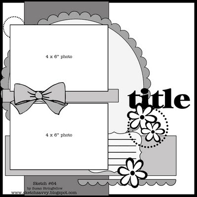
I know you guys always ask for more layouts using landscape oriented photos, so here is another one. And for my friends who are asking for more layouts with one landscape and one portrait (you know who you are :), I am working on it. Those are tricky for me too. LOL! For my example I used the new Basic Grey Out of Print Collection. If you would like to see close ups and details, Visit my Blog HERE.
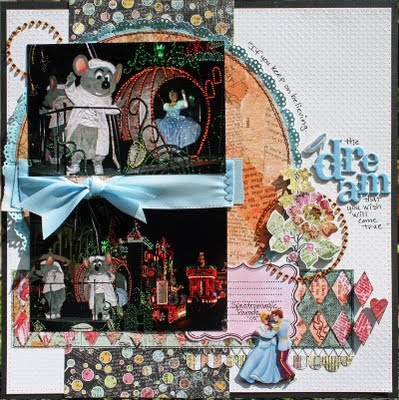
ok you guys are going to love this! Anita took this sketch and sketch #62 and combined them into one really beautiful 2 page layout! Isn't that a neat idea?! Thanks for sharing your pages, Anita Visit Anita's blog HERE
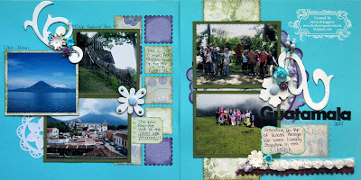
Jenny just sent me this precious page and I just had to share. I love her papers and use of the banners. Visit Jenny's blog here for more.
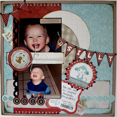
here is a page from Shaunery with some cool ribbon edging on the circle. Don't be afraid of texture going under photos, just cut it where it goes under the edge and you don't have to worry about the bump. :) Thanks Shaunery! Visit her blog here.
 Joni sent me this totally fun version of the sketch. I think the buttons across the middle are perfect. Visit Joni's Blog HERE
Monday, August 22, 2011
Sketch #63 12x12 and a Cut file!
I know some of you love cut files and probably thought I had given them up but I just haven't felt inspired lately. Well I needed a good border for this page so I made this fleur border. I am giving you a link to the SCUT2 file as well as a .jpg image so you can use it with some of your die cutting machines.
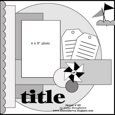
***Here is the link for the Fleur Border SCUT2 file***
***Be sure to mention SketchSavvy with a link when you use this file. As always, please leave a comment and let me know what you think of the sketch and cut file. Have Fun!
And here is the .jpg image - click the image to enlarge before saving.

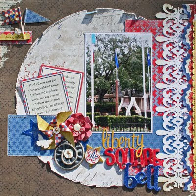
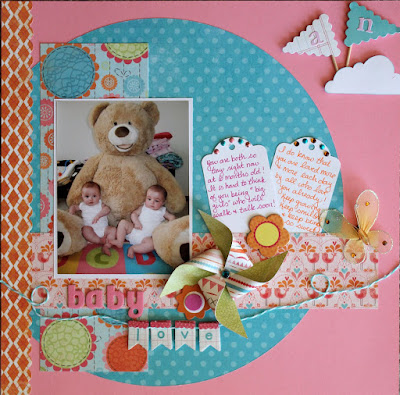
Oh my goodness, you have to see this adorable layout from Melissa D. She has the sweetest photo but the papers and embellishments are just great fun too. This is a great example of how the same sketch can look completely different. Have you guys ever used one sketch twice? Give it a try. Visit Melissa's blog here for more.


***Here is the link for the Fleur Border SCUT2 file***
***Be sure to mention SketchSavvy with a link when you use this file. As always, please leave a comment and let me know what you think of the sketch and cut file. Have Fun!
And here is the .jpg image - click the image to enlarge before saving.

Oh my goodness, you have to see this adorable layout from Melissa D. She has the sweetest photo but the papers and embellishments are just great fun too. This is a great example of how the same sketch can look completely different. Have you guys ever used one sketch twice? Give it a try. Visit Melissa's blog here for more.

Tuesday, August 9, 2011
Sketch #62 12x12
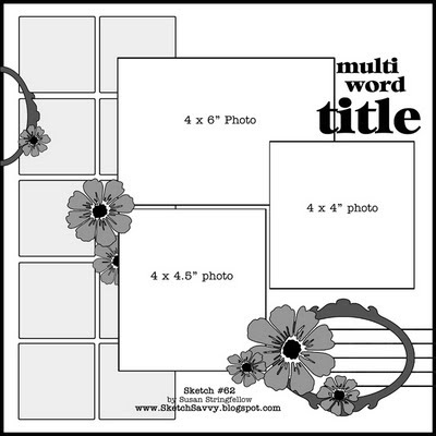
Here is my example - I also created this page for Color Combos Galore challenge #204 HERE. For close ups and details visit my blog HERE
Colinda sent me a link to her wonderful travel page. I love that this sketch lets people use all their fun patterned papers. I just love the blue and orange combination. Check out Colinda's blog here
http://www.blogger.com/img/blank.gif
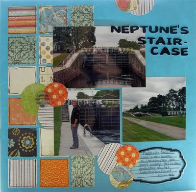
More awesome papers used here in Shaunery's layout. Just rich colors that are ideal for her photos. Visit Shaunery's blog HERE.
 Joni sent me this super warm rich page using this sketch and I just love the way she stitched the blocks. Visit Joni's blog here to see more great pages
Monday, July 18, 2011
Sketch #61 12x12
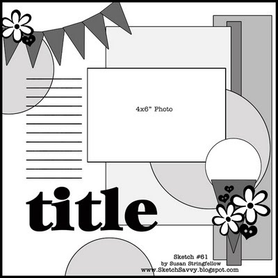
Sorry guys - I completely forgot to add my example for this challenge. Actually a storm knocked out my pc that week and I am just now catching up. Here's my page and you can see why there is an ice cream cone in the sketch. LOL! For closeups and details visit my blog HERE.
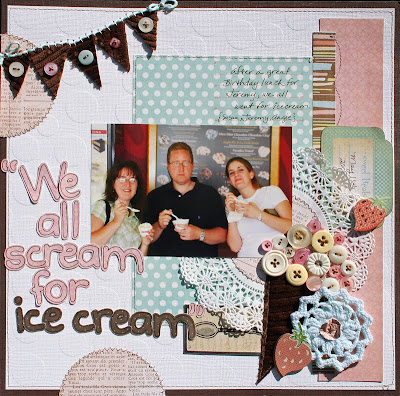
And here is a fantastic layout by Joni Parker. I just love the title, photo and perfect Basic Grey papers that she chose. Visit Joni's Blog HERE
Tuesday, June 28, 2011
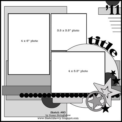
Sketch #60 12x12
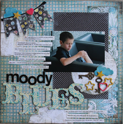
For my example I have used the Archaic Collection from Basic Grey. For more details and close ups, Visit my Blog HERE.
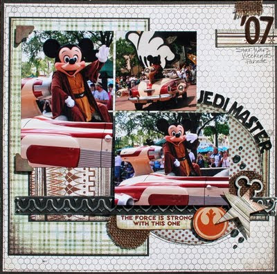
You have to see this amazing layout by Erin at Die Cuts With a View using their fun New All About Boys Stack. Could it just be any more perfect? If you haven't seen this stack, check it out because it has some really great prints that are not just for boys. The August Stack-a-holic Template challenge uses this sketch so she actually did two pages with this sketch. Click here to check it out on their blog.
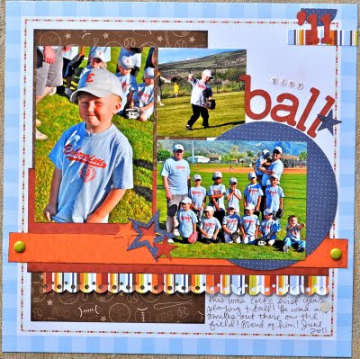
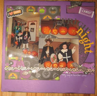
A frightfully fun layout from Merrick! Aren't they just too cute - what a fun group Visit Merrick's blog Here.
Sunday, June 5, 2011
Sketch #59 12x12
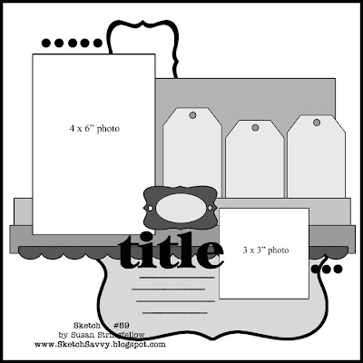
I have to say that this is one of my favorite sketches. I just had to find the right photos to make an example for you guys.
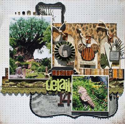
For my example I used the new Zoology Collection from Bo Bunny. For close ups and details visit my blog HERE
Laurie share this beautiful layout. For close ups visit her blog HERE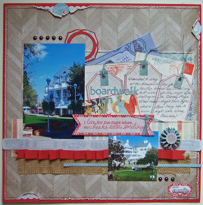
Check out this page by Shaunery, because even if you don't feel like doing the tags or you have other fun elements in mind, the sketch can still be a great starting point. Visit Shaunery's blog here for lots of close ups.
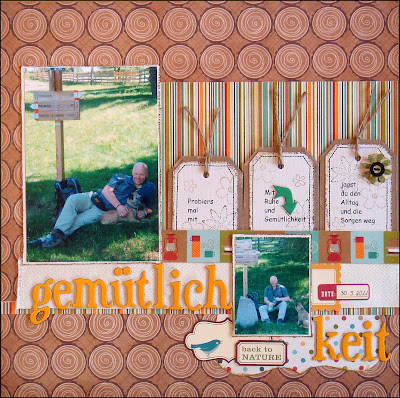
Elke sent me this beautiful relaxing layout and I just love the stamping that she added to the tag backgrounds. Visit Elke's blog HERE for close ups and other great layouts too. Thanks Elke!
 I love this version of the sketch, by Joni Parker. She has precious photos to work with and you can see she has the basic design but took her own spin on it and it is just so perfect. Visit Joni's Blog HERE.

For my example I used the new Zoology Collection from Bo Bunny. For close ups and details visit my blog HERE

Laurie share this beautiful layout. For close ups visit her blog HERE

Check out this page by Shaunery, because even if you don't feel like doing the tags or you have other fun elements in mind, the sketch can still be a great starting point. Visit Shaunery's blog here for lots of close ups.

Elke sent me this beautiful relaxing layout and I just love the stamping that she added to the tag backgrounds. Visit Elke's blog HERE for close ups and other great layouts too. Thanks Elke!
 I love this version of the sketch, by Joni Parker. She has precious photos to work with and you can see she has the basic design but took her own spin on it and it is just so perfect. Visit Joni's Blog HERE.
Subscribe to:
Comments (Atom)


