Friday, October 19, 2012

Sketch #99 12x12


 For my example I have used Echo Park's "So Happy Together" collection. For close ups and details, visit my blog HERE.


Here is a great take on this sketch with a totally different style than my page. Tami went for a more retro look with Basic Grey Hipster to go with her photo. Visit Tami's Blog here


Now for one of your examples. This one is from ScrappinHard and it's just adorable with her little pumpkin. I think my fave bit is the trees up there in the corner, SO cute. Visit ScrappinHard's Blog HERE for more close ups.

Joni Parker sent me this fun page about something from her bucket list and I love that it's one of my fave places too. Such a fun vacationy looking page. For more of Joni's creations, visit her blog HERE.

And here is another great example with a fun holiday layout by Brenda Ragsdale. Visit Brenda's blog here.

Monday, October 15, 2012

2 Page Sketch #17


***You will have to click on these to see them full size -
 my blog just wants them to be crazy small for viewing***

 For my example today I have used the gorgeous New Carta Bella "Traditions Collection". For close up photos and details visit my blog HERE


You have just got to see this gorgeous one page example from Eli. Love the stitched vellum with hearts, the bird, and the adorable photos - not to mention the beautiful black and white kitty :)
Visit Eli's blog HERE.


Tuesday, September 11, 2012

Sketch #98 - 12x12"

For my example I flipped the image horizontally. I used the New Echo Park "Chillingsworth Manor" collection. It's got so many fun stickers and its ideal for Haunted Mansion :) For details visit my blog HERE.
Check it out - ScrappinHard just sent me this totally fun layout using this sketch. It's so completely different than my Haunted Mansion page but so perfect. Visit her site HERE for details.

Tuesday, August 28, 2012

Sketch #97 12x12


This is a great sketch for some of your favorite patterned papers because you have 5 big panels. For my example I used Echo Park's So Happy Together Collection. For close ups visit my blog HERE.


Sunday, August 12, 2012

Sketch #96 12x12

For my example I used Echo Park's So Happy Together Collection. For close ups and details visit my blog HERE. 
 
Here is a fantastic example from Val. Old barns are just so cool! And don't you just love that big title?! For details visit Val's Blog HERE.

And here is a super fun layout from Orlanda! 


Wednesday, August 1, 2012

Sketch #95 12x12

Here is my example. I used a journaling block in place of one of the small photos and my large photo is 5 x 6.5". I used Echo Park For the Record collection. For details and close ups, visit my blog HERE.

Here is a fun example from Tami. I just really need more of this MME paper because its looks so great for Disney pages! Actually this is a great disney sketch really. Visit Tami's blog here for details and photos of her kitten helping with the page :) 


Kathy Perry shared this beautiful page with us and her papers, designs and photos are just perfect. 


This next layout is from Julia McKenzie-Grant and its just about the cutest thing.  love these Simple Stories papers. I am so glad she shared with us. Visit her gallery here. 


 Monique Nicole Fox just sent me this beautiful version of the sketch with an addition of a banner piece at the top. And don't you just love the use of the doily cupcake picks as flag embellishments! Visit Monique's gallery HERE

Wednesday, July 18, 2012

Sketch #94 12x12"

For my example I flipped the sketch. I used the new Echo Park Paradise Beach collection. Click HERE for close ups and details on my blog.
Merrick sent me this super cute layout. Love the papers and pinwheels but that stitching is just the best! Visit Merrick's blog here.

Just look at this gorgeous page from Orlanda. You just have to love Alice and the White Rabbit!
 

Sketch #93 12x12"


Sometimes a sketch catches your eye and you really want to do it but you don't have the correct number of photos. Do you have to find another sketch? no, not at all. Bend the sketch to your own style and photos. I will probably scrap this one again with two photos because I really like it, but I only had one photo of my son "Whacking a Alien" so here is my interpretation + aliens. I used October Afternoon papers.


Here is another Disney layout but totally different! This one is by my friend, Laurie, in the Haunted Mansion queue. For details and close ups, visit Laurie's blog HERE. 


Here is a layout by Brenda and she also used one layout but in a different way. What a great layout and do you love her tag? Visit Brenda's blog HERE for more of her layouts. 


Thursday, July 12, 2012

2 Peas Workshop & and a chance to win!


***WANT TO WIN A SCRAPPING WORKSHOP!?!***


Sure you do! I have to do a little enabling here - I was lucky enough to be asked to contribute 2 Disney layouts to Nancy Damiano's Scrapbooking Family Vacations Workshop at 2peas. I am a big fan of Nancy's and I think you guys would love her style.


SoCLICK HERE to visit my Blog for a chance to win a workshop! I am going to do a random drawing for the winner.

Wednesday, July 11, 2012

Sketch #92 12x12"

Here is my example using October Afternoon's Farmhouse Collection. For details and close ups visit my blog HERE.
Madeline had two photos and used this sketch beautifully. I just love beautiful papers she used. Visit Madeline's Blog HERE for more photos and details.
Here is an example from my friend, Shaunery. You just have to visit Shaunery's Blog HERE to see all of her close up photos because she always has so many super cool details. She used Echo Park's Note to Self collection and look at the cool use of the doily.
Merrick was kind enough to share her layout as well. I am just loving this sketch after seeing all of the different ways you guys are using it! Visit Merrick's Blog HERE.

Sunday, June 24, 2012

Sketch #91 12x12"


For my example I used Basic Grey "What's Up" collection along with a few pieces of BG "Kioshi" and the green is from "Archaic". I really wanted to use this sketch for my rainbow photo but I had two photos for this page so I just put my second photo where the journaling block is. Of course you don't have to use clouds and rainbows but I just thought it would be fun. For details and close ups, visit my blog here.

Tami did this amazing Christmas layout using this sketch and she even did a fantastic tutorial for the quilted elements, visit her blog HERE for details. Thanks Tami!!!

Tuesday, June 19, 2012

Stretch a 1 pager into a 2 pager (Part 2)

Today I wanted to show you guys something fun. Tami and I each turned Sketch #90 into a two pager and we both chose a winnie the pooh theme. I thought you might like to see the 2 versions and hopefully it will inspire you to give it a try. 

Yesterday's post showed you that you can use the same sketch twice to make a 2 pager or you can stretch it. Both of us stretched our pages and since this is a single photo layout, when you stretch it to a 2 page layout, you may want to add more photos. We each had different numbers of photos and different sizes. But if you look at the basic background shapes, you will see that they are inspired by the sketch. 

First, Here is Sketch #90 and below is Tami's "Pooh Bear and Eeyore" layout followed by my "Magic of Disney Animation" layout. 


Monday, June 18, 2012

Stretch a 1 pager into a 2 pager (Part 1)

I think it's time to share a great idea with you guys. My good friend Tamera has been stretching some of our fave one page sketches so that she can use them for two pagers. There is no set way to do this, but the two ways that I have learned.

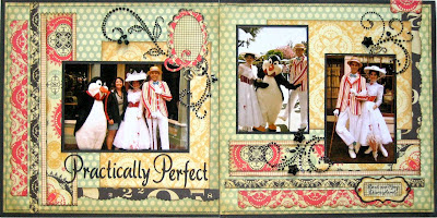
First, you can take the original sketch and use it facing two directions. Meaning that you can do the left page as the original sketch looks and then flip, mirror, or turn it, to use for the right side of the layout. Here is an example from Tami "Practically Perfect" using Sketch #52.


Here is another layout of Tami's where she turned the page to create a two page layout "Part of our World"

Now the 2nd way is the Stretching method. This works great for most of the sketches but you may have to add extra photo placement or embellishments.
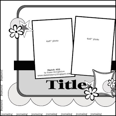
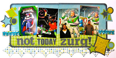
This is one of my favorite pages that Tami has stretched "Not Today Zurg!" using Sketch #22 Now the sketch just looks like its missing half!

And here are a couple more of examples using the sketch stretching "Spring in Concord", "Duck Tales" and "Plutos Corner"

Sketch # 90 12x12

For my example I used Crate Paper from several of the collections. I cut the hexagons with my Cricut.

Here is a stunning page by my friend, Shaunery. You just have to visit her blog to really see details HERE.

Now for a completely adorable kitty enjoying the sunshine! Love these DCWV Lemon Flower papers for a kitty page. They went so well with my grey kitty for a page too. Anne sent me this cute page and you can see more of her work HERE