Sunday, June 24, 2012

Sketch #91 12x12"


For my example I used Basic Grey "What's Up" collection along with a few pieces of BG "Kioshi" and the green is from "Archaic". I really wanted to use this sketch for my rainbow photo but I had two photos for this page so I just put my second photo where the journaling block is. Of course you don't have to use clouds and rainbows but I just thought it would be fun. For details and close ups, visit my blog here.

Tami did this amazing Christmas layout using this sketch and she even did a fantastic tutorial for the quilted elements, visit her blog HERE for details. Thanks Tami!!!

Tuesday, June 19, 2012

Stretch a 1 pager into a 2 pager (Part 2)

Today I wanted to show you guys something fun. Tami and I each turned Sketch #90 into a two pager and we both chose a winnie the pooh theme. I thought you might like to see the 2 versions and hopefully it will inspire you to give it a try. 

Yesterday's post showed you that you can use the same sketch twice to make a 2 pager or you can stretch it. Both of us stretched our pages and since this is a single photo layout, when you stretch it to a 2 page layout, you may want to add more photos. We each had different numbers of photos and different sizes. But if you look at the basic background shapes, you will see that they are inspired by the sketch. 

First, Here is Sketch #90 and below is Tami's "Pooh Bear and Eeyore" layout followed by my "Magic of Disney Animation" layout. 


Monday, June 18, 2012

Stretch a 1 pager into a 2 pager (Part 1)

I think it's time to share a great idea with you guys. My good friend Tamera has been stretching some of our fave one page sketches so that she can use them for two pagers. There is no set way to do this, but the two ways that I have learned.

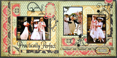
First, you can take the original sketch and use it facing two directions. Meaning that you can do the left page as the original sketch looks and then flip, mirror, or turn it, to use for the right side of the layout. Here is an example from Tami "Practically Perfect" using Sketch #52.


Here is another layout of Tami's where she turned the page to create a two page layout "Part of our World"

Now the 2nd way is the Stretching method. This works great for most of the sketches but you may have to add extra photo placement or embellishments.
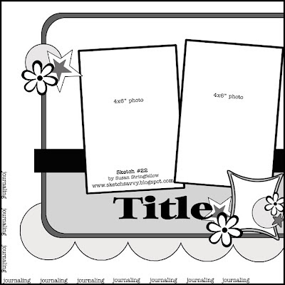
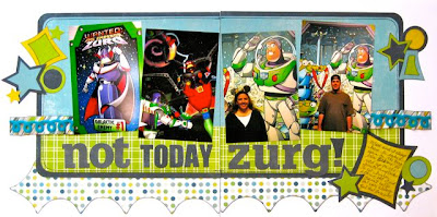
This is one of my favorite pages that Tami has stretched "Not Today Zurg!" using Sketch #22 Now the sketch just looks like its missing half!

And here are a couple more of examples using the sketch stretching "Spring in Concord", "Duck Tales" and "Plutos Corner"

Sketch # 90 12x12

For my example I used Crate Paper from several of the collections. I cut the hexagons with my Cricut.

Here is a stunning page by my friend, Shaunery. You just have to visit her blog to really see details HERE.

Now for a completely adorable kitty enjoying the sunshine! Love these DCWV Lemon Flower papers for a kitty page. They went so well with my grey kitty for a page too. Anne sent me this cute page and you can see more of her work HERE


Monday, June 11, 2012

Sketch #89 12x12

Here is my layout for Sketch #89 using new Recollections Surfs Up Stack by DCWV. For details and close ups, visit my blog HERE

Monday, June 4, 2012

Sketch #88 12x12"

This is not the most exciting looking sketch but it gives you a bit of room to play with adding embellishment or strong patterned papers. For my example I have used some Pink Paislee London Market papers and Ephemera. And here is a really great UK Epcot page from my friend, Wendy Mitchell. I love the papers she chose.
Check out this great layout by Kristin Fougeron. Visit Kristin's blog for close ups.
A little holiday cheer from Merrick :) Visit Merrick's blog here for more inspiration.
And you have to smile at this page from Tracey. Great use of Echo Park's Life is Good Collection. Visit Tracey's blog here.