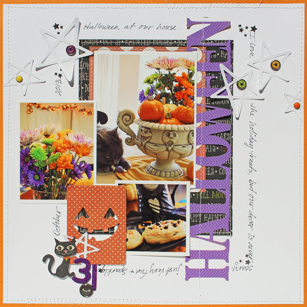
For my layouts I am using the October "Thriller" kit, add on kit, and stamp set.
First I will share the sketch that inspired the two layouts below. Sketch #133
For my first example I have replaced the hexagon design area with a combination of my title letters to spell out "Halloween Ornaments" and some of the leftover alphas. This is a fun way to use up extra alphas that you have left in sets where you have used the most common letters. I especially love these glitter letters for a sparkly page element.

For my next example I rotated the sketch to the left, used 3 photos rather than the one, and for the long strip of paper I cut out the title "Halloween" about the same length and tucked it behind my photos. Also in the sketch there is a stitched line element that I have replaced with my journaling.


Amazing Halloween pages! Love the traditional colors on white!! Really pop!!! Pinning!
ReplyDeleteGreat sketch, Susan, and love your layouts, especially that first one. AWESOME title work....so fun!
ReplyDeleteFirst, I love your Halloween decor, Secondly I adore the fact that you showed two very different interpretations of your sketch and that neither of them was literal. I tend to be very literal with sketches and am not as much of a think outside the sketch as most people so the use of the letters instead of shapes and the title instead of a strip of paper are both brilliant!
ReplyDelete